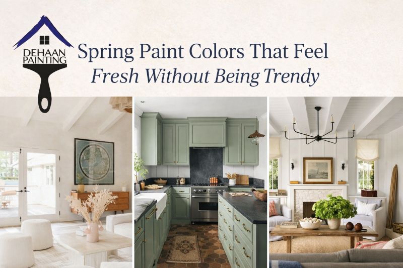
As we settle into the cooler, quieter days of mid-November, this is our annual moment to look ahead — to identify what’s fading out in color trends and what clients and designers are already asking us about for 2026. At DeHaan Painting, we believe in helping homeowners and designers make choices that feel modern and enduring (not trendy one season, outdated the next). Below are some observations, projections, and advice — with a bit of color confidence.
What Designers Are Quietly Abandoning in Late 2025
Before diving into 2026, it’s helpful to note which colors (or color stances) are quietly becoming passé. In our work, we’re seeing these declines firsthand — and in design media, the signals are loud.
1. Cool grays & “millennial grey”
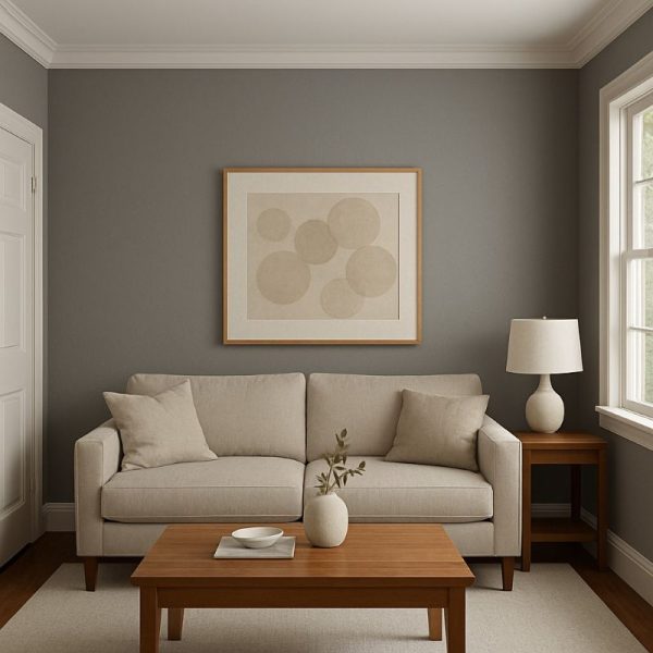
Gray has had a long run. It’s been a go-to neutral for years. But now, more and more designers are pulling back from those cooler, bluish-grays in favor of warmer, more organic neutrals.
In many homes we visit, clients ask, “Do I need to repaint if my walls are a medium gray?” The answer increasingly is yes — if you want your space to feel current.
2. Stark white / ultra-bright whites
Pure, blinding whites are also losing favor. They often read cold, sterile, or too clinical — especially in rooms without copious natural light. Designers are calling for whites that lean warm or have subtle undertones rather than being “pure” white. In projects, we’re being asked to tone down whites, or to pair whites with gentle contrast so the look doesn’t feel “flat.”
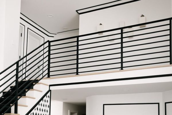
3. Overused black accents (especially in hardware, railings, and trim)
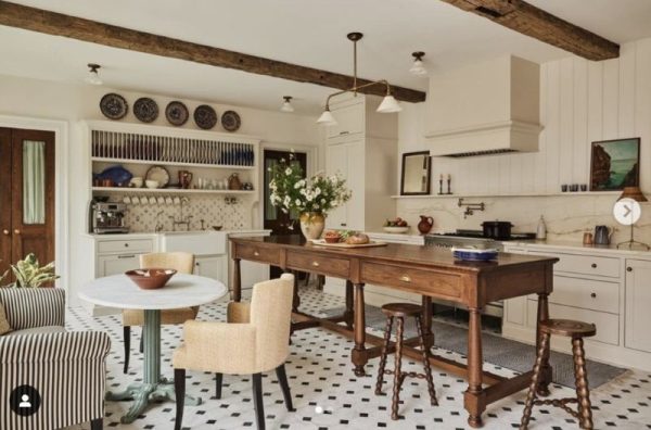
Bold black pulling–out elements have had their moment — black rails, black spindles, black plumbing fixtures, black metal trims. But the pendulum is swinging. Some designers caution that strenuous use of black can feel harsh or too contrasty. In our field, we’re seeing more clients prefer dark neutrals (deep browns, charcoals) or soft contrast rather than stark black.
4. All-beige / “safe-beige” monotony
In recent years, many homes leaned hard on beige, taupe, and greige — sometimes across multiple elements, from walls to trim to cabinetry. But the “safe-beige everywhere” approach is being rethought. When every surface shares the same tone, spaces can feel one-dimensional, lacking depth, or uninspired. Designers now emphasize layering neutrals, mixing in richer tones, or even injecting small contrast pops.
Why this shift matters for us
As painters and finishers, we don’t just bring a client’s vision to life — we also guide them toward choices that will still feel current in a few years. When someone says, “Our walls are neutral already, ”we gently ask: is that neutral one that will truly stand the test of time?
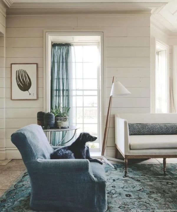
What We Expect (and Encourage) for 2026 Interiors & Cabinetry
From conversations with designers, color houses, and our own clients, here’s where we see the momentum building — and where DeHaan Painting is preparing to lean.
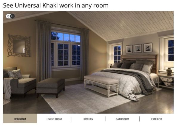
1. Warmer, “sanded” neutrals as anchors
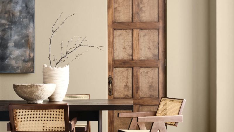
Instead of cold greys or flat whites, expect neutrals that have warmth, texture, and depth to dominate. Sherwin-Williams’ 2026 pick, Universal Khaki, is a prime example: a mid-tone tan with a whisper of softness. It’s part of a broader shift toward “grounded neutrals” that feel lived-in. These neutrals serve as a stable foundation, allowing accent colors to play without feeling chaotic.
On the same note, Dutch Boy’s Melodious Ivory — a creamy, warm neutral — is gaining traction.
2. Earthy greens and organic tones
We anticipate a continued rise in nature-inspired greens and muted botanicals, but with warmth built in. Valspar already named its 2026 Color of the Year Warm Eucalyptus, signaling this trend. Valspar In cabinetry, these hues provide a refreshing alternative to all-white or all-gray kitchens.
Other declared (or emerging) 2026 colors include:
- Hidden Gem by Behr — a smoky blue-green that bridges neutrality and color. Behr
- Warm Mahogany (Glidden) — a rich, red-leaning tone that works beautifully with wood and trim.
- Divine Damson (Graham & Brown) — a dramatic burgundy that designers see as a moody accent.
These tones offer depth and connection to nature, while retaining elegance.
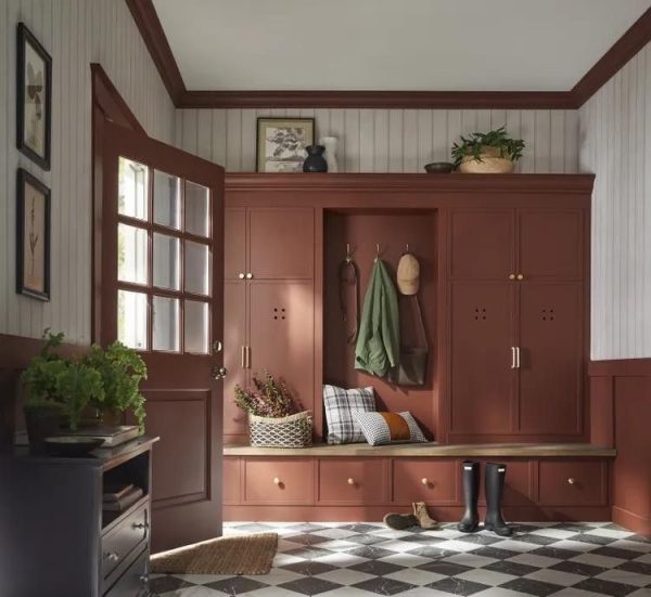
3. Rich, moody accent colors
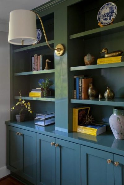
Accents won’t disappear in 2026; they’ll just be more intentional. Deep jewel tones, moody reds, aubergines, and darker neutrals are being used to anchor rooms, especially in smaller “rooms within rooms” — powder rooms, libraries, closets.
One magnetic shift we’re watching: blue cabinetry. Yes — blue is making a comeback in kitchen design, potentially replacing the gray cabinetry era. Home & Gardens recently called out that gray cabinets are “on their way out” and suggested bold blue as a leading 2026 option.
4. Layered contrast and tonal richness
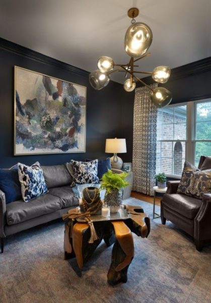
The “match all your trim and walls” approach will wane. Instead, rooms will embrace layered contrast — soft neutrals juxtaposed with warmer accents, or deeper tones reserved for architectural features (wainscoting, built-ins, island cabinets). This layering creates visual interest without feeling busy.
For example:
- Walls in a warm neutral
- Cabinets in a coordinating but deeper shade
- Trim or interior detailing in darker or contrasting tones
5. Texture & finish becoming part of color
Color doesn’t exist alone. The interplay of sheen, texture, and finish is becoming part of the design narrative. Matte and eggshell finishes that reveal nuance; subtle glazing or washes; soft grain effects on cabinetry to expose some material richness. These techniques allow a color to change character under different light, giving more dimension.
6. Accent walls fade; fully immersive palettes rise
We’re less likely to see isolated accent walls. Instead, “color drenching” — the idea of enveloping entire rooms (walls, ceilings, trim) in variations of a single or complementary palette — is becoming more popular. This approach makes smaller rooms feel cohesive and bold rooms feel intentional, not haphazard.
What This Means for Your Next Project (From Our Lens)
At DeHaan Painting, we’re preparing our tools, color samples, and conversations around these trends so that when you call, we’re ready for a forward-facing palette. Whether you’re refreshing walls or redoing cabinetry, here are a few thought-starters we’ll bring to the table:
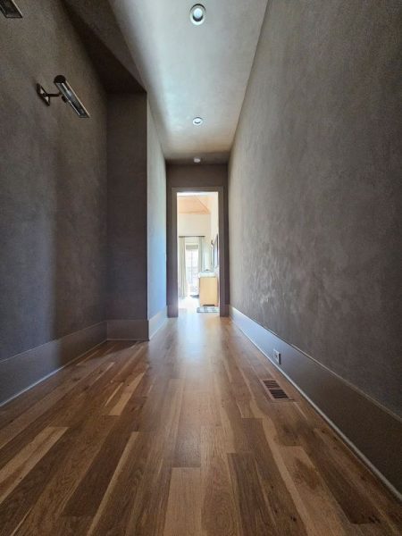
- Start with a warm neutral anchor. Let that be your “canvas” — not too cold, not too flat.
- Use deeper shades strategically. Cabinets, islands, or accent features are great places to bring in depth.
- Experiment with color on smaller scales first. Try a pantry wall, a built-in niche, or even cabinetry doors before you commit to the whole room.
- Ask about finish and texture. Two spaces painted with the same color can feel wildly different if the finish or sheen changes.
- Don’t overcommit to purely trendy colors. If you like a bold hue, balance it with a more timeless neutral so your space ages well.
- Work with natural light. In darker rooms, warmer shades (even neutrals) perform better. In sunlit rooms, richer tones can thrive.
As 2025 winds down, we believe 2026 will favor warmth, depth, and organic influence over cold minimalism. The colors that disappear will be those that feel flat, overly stark, or uninspired. The colors that endure will be those that resonate — to the eye and to the soul.
If you’re contemplating a repaint or cabinetry refresh, now is a great time to start exploring color direction. We’d love to help you translate these trends into something uniquely yours — beautiful, lasting, and very you.
Warmly (and colorfully),
DeHaan Painting
Thinking about new paint or cabinetry?
There’s no better time to discover new color possibilities. If you’re thinking about refreshing your walls or cabinetry, we’re here to guide you through the latest trends and tailor them to your home. Together, we’ll craft a look that’s timeless and uniquely you.

Helping Thousands of Families in Plaza Midwood, Noda, Chantilly, Dilworth, Elizabeth, Myers Park, South Park, Barclay Downs and Surrounding Areas.
DeHaan Painting
“Charlotte’s Premier Painter”
Dock, Deck, Fence Staining – Interior House Painting – Exterior House Painting – Kitchen Cabinet Painting – Limewash Applications – Commercial Painting – Christmas Light Installer
Phone: (980) 224-3191
Email: info@dehaanpaints.com

